
Okay, I’ll give you the heads up. A PR company approached me and asked if I’d like to attend an awards night that involved a high profile paint company.That was LAST NIGHT. I’m always curious to see what’s hot in the world of interior design and architecture, so would like to have been there but had to decline due to a full calendar.
Still, they sent me the results and I have to say, I am mighty impressed. Because I wasn’t there, I wouldn’t normally post this BUT being an arty type who dabbles in oil painting, even the use of wall paint intrigues me when it’s done with a bit of imagination. Who knows – maybe these images will inspire you to pull out a paint brush next weekend?
There were winners in both commercial and residential categories, plus interior and exterior awards, but I’m just going to show you the one’s that I liked the best. A quick Blog is a good Blog as Fletch always says…
Here’s just a couple of winning photos from the DULUX COLOUR AWARDS 2013:
The BIG MOTHER of prizes on the night was the GRAND PRIX 2013 Dulux Colour Award, for – ‘innovative use of colour in architecture and design’. This was awarded to the Atherton Gardens HUB Development in Melbourne and was co-designed by McCabe Architects and Bird de la Coeur Architects. That entry also took out the prize for Best Multi Residential Exterior. What a fantastic use of bright, bold colour to liven up a dull, inner urban environment! Love it.
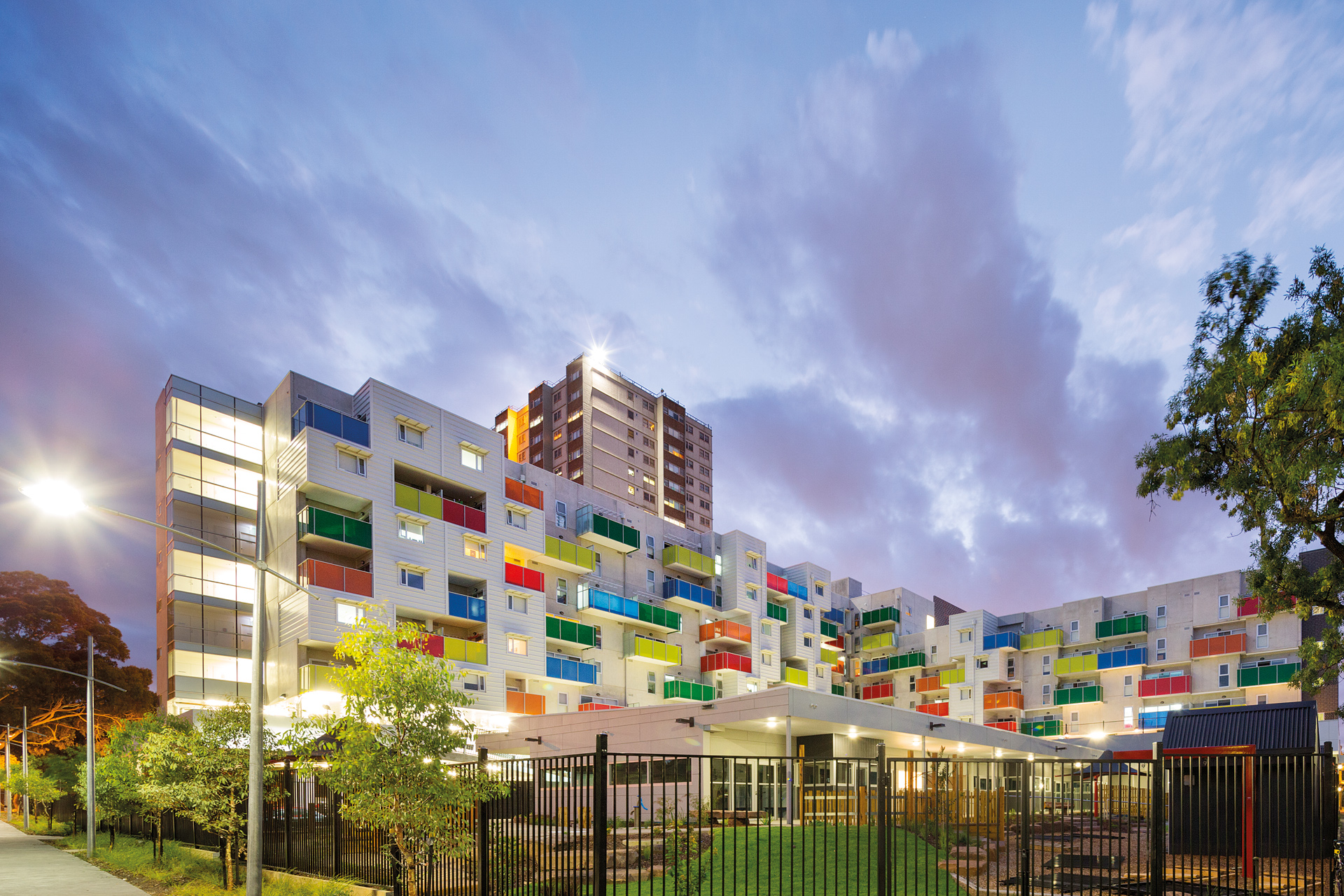
Dulux Grand Prix winner – Atherton Gardens, Melbourne
Winner of the Best Commercial Exterior went to the Wintergarden Façade in Brisbane, designed by Melbourne company, Studio 505. A very innovative outdoor design (see below) that reminds me of a structured version of a Jackson Pollock painting – but WAAAAaaaay bigger. Maybe we should add one to Federation Square in Melbourne??
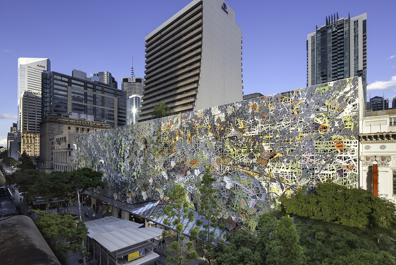
Wintergarden Facade
The next one, I fancied purely because of the simplicity. It’s perfect for an early-learning centre – bright colours, yet softly co-ordinated. This is from the John Septimus Roe Anglican Community School (JSRACS) Campus, in Western Australia by Brooking Design Architects. Isn’t that something we could all manage – surely? Stripes on a wall. Great idea.

John Septimus Roe Anglican Community School (JSRACS) Campus, in Western Australia
But for me, the category of most interest is Best Residential INTERIOR. I saw these pictures and was instantly BORED with the neutral, safe tones in our living area. I am feeling an urge for change. Big, BOLD colours!!! Like this winning design from a Queen St Residence, Melbourne, by Edwards Moore Projects Pty. Ltd.
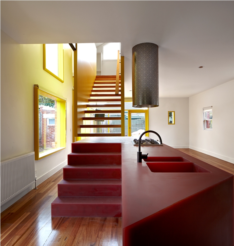
Queen Street Residence
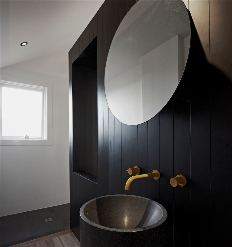
Queen Street bathroom
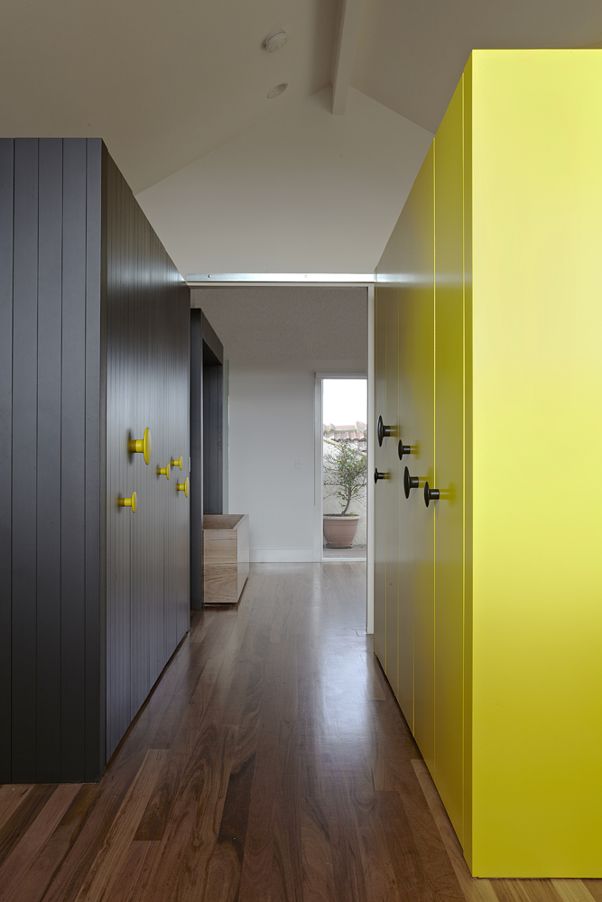
Bathroom cupboards
In fact, apparently one of the main judges said on the night that the trend for BRIGHT colours was a common element among most of the entrants and winners. So there you go folks – looks like the days of beige, earthy interiors are over and it’s time to be BRAVE and immerse yourself in colour! Thank God. I am so OVER neutral. This could be fun…
Looking at the house above, I’m particularly keen on the combo of red and yellow, and yellow and black. I’m going to chat to Fletch about copying this in our backdoor entrance area. Although I think you’d need to get hold of some of those cool door knobs in bright colours too, to make it work. Fletch is going to be SO happy I have found a new domestic project for us!!!!
(If you’d like to see more photos of winners from the Dulux Colour Awards, go to this website: www.dulux.com.au/colourawards)
(NOTE: I was not paid, nor have I received any free paint to post this Blog. I just liked the story and pictures. People still find it hard to believe I don’t do this for money, but it’s true.)
